Using satellite imagery to study ice conditions on Helsinki sea ice
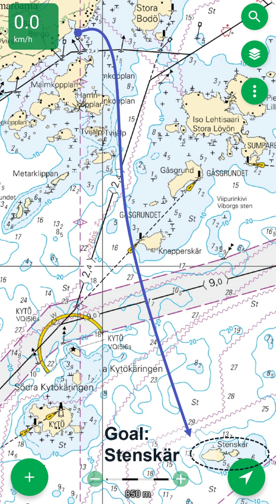
The plan to run to Stenskär in true colour view February 7th 2026 (Copernicus/Sentinel)
Running on outer sea ice is a rare treat and not possible every year. I know many people just go out there and have fun, trusting their spontaneous read of the conditions. Having done a few higher risk hikes around the world and now as a father, safety margin has become essential. Sea ice is something to be treated with respect. Indeed, the same day (February 9th 2026) I went out, a few experienced wing skaters were rescued from a breakaway ice floe 5km east near Koirasaari.
Finland sea ice extent statistics. (Graph from FMI)
The Finnish Meteorological Institute publishes daily ice charts detailing ice conditions around Finland. It is the best resource for understanding ice formation and regimes on the coast. However, it is primarily done to inform maritime operations. As such, what is considered a uniform ice field for ships can easily have cracks and holes to disappear a small human, especially around risky areas like narrows and reefs. Sea ice is alive and changes by the day. But it does give an excellent frame of reference.
The ice chart put my target area within the darker purple “10-20cm new ice”. On paper, this supports a human. In practice, two wing skaters were rescued from it. The map resolution is poor with islands a kilometer wide not even appearing on it.
Screenshot from published ice conditions. Target study area circled. (FMI).
My thinking was, can satellite imagery tell me anything more to help me understand risks on the way?
Here is a good place to tell that I’m a complete amateur at this, so what follows is at worst dangerous, perhaps useless in practice. I strive to make it an honest documenting of what I did.
After exploring free Copernicus satellite imagery, I devised a simple step-plan - though had no clue what those four-letter abbreviations were at the time:
1. Is there liquid water visible? (False Colour)
2. Is it persistent? (NDWI)
3. Has the ice surface structurally shifted in the last days and are there notable anomalies? (NDVI)
4. Do depth charts explain any of the risky features? (Nautical charts)
It is good to keep in mind that none of these will tell me ice thickness, but possibly inform me of wet areas, cracks and structural anomalies. Also, the data was a few days old and much can change in a few days on sea ice.
1. False Colour analysis reveals waste water treatment outflow pipe
The water shows beautifully in the false colour imagery below. It easily reveals the high traffic shipping lanes that are absolute no-go territory, but it also showed a round black dot though very small in the image below, marked “open water: 50m diameter”.
The miniscule dot appears steadily in all available imagery. The only thing I could think of was the outflow for the Blominmäki wastewater treatment plant. It processes the wastewater for Espoo and pushes out an average 1 300 liters of warm (<4°) water per second, based on the reported 41 million m3 processed annually. I don’t know how widely it affects ice strength but decided to give it a berth of at least 300m. It probably doesn’t ever freeze over, so easy to spot also on the move.
False colour imagery analysis Feb 7th 2026 (Copernicus/Sentinel)
The more difficult feature to analyse were the three question marks and the larger horizontal boundary the darker shades create on my route. It looks a bit like surface water when compared to the known water areas east on the shipping lanes, but not decisively. However, the way the blue wisps stretch west to Porkkala and East over the shipping lanes resemble the texture of wispy, thin clouds. Luckily, Sentinel data has scene classification and showed a medium probability of clouds almost exactly on that area. Medium likely because of very thin clouds. NDSI (Normalised Difference Snow Index) was of little help here as the resolution struggled to separate ice and near-open water.
The conclusion: No open water on my route and the ice field seems uniform. Because of this, we can skip step 2 to study how persistent the water is (though I did look at NDWI) and move onto 3 to study structural shifts.
3. NDVI reveals a shipping lane on the route
The NDVI is a vegetation index and the islands show green because of that, but we can also use it for studying other surface. Grey areas mean high reflectivity, likely indicating clear ice, which could be fresh/thin ice or just ice cleared from snow by wind. We earlier concluded that cloud cover disrupts the view near our goal, so the surrounding grey areas are more static than anything on the ice surface and not reliable.
3 days ago I had no idea what NDVI is. I clicked it open to test it and immediately saw a shipping lane crossing my planned route. Sure, a look at any nautical chart would tell me the same thing but not if it’s in active winter use. If there is one rule given to people who venture out in Helsinki, it is: Do not cross shipping lanes. Good rule.
NDVI analysis reveals shipping lane on my path (Copernicus/Sentinel).
However, as ships and vessels are a close fourth in my heart after sauna, aviation, my wife and daughter (not necessarily in this order), I wanted to find out more. The lane we see is the Helsinki-Porkkala inner lane, which news articles told me is only opened when ice conditions become too challenging in the center of the gulf. This was not the case yet.
Satellite imagery going back 10+ days wasn’t conclusive, but the structure remained extremely static indicating that no ships have passed recently, especially as Marine Traffic shows Silja, Viking and Tallink steadily using the main route. Furthermore, NDWI-analysis (the step 2 we skipped used to study persistent water) showed no features, but does on the active lanes east near Helsinki.
Having said that, the takeaway here is not that the lane was safe to cross, but that there was a lane in the first place and extreme care would be needed around it. The NDVI didn’t reveal other structures. Though my findings later supported its use well: All grey were indeed areas mostly free of snow (despite True Colour showing white snow coverage)
Conclusion: Don’t fall in the shipping lane. Take a final look at depth charts to chart other risky points.
4. Depth charts don’t conflict any of the findings
I was mostly interested in underwater rocks and narrow formations on the seafloor that might channel water and generate heat flux toward the surface. On my route after the islands, nothing stood out this time.
Nautical map from Karttaselain app.
The resulting run
This post is about the preparation process and not the run itself, but the 14km run was magnificent.
My flight instructor once told me that a good pilot always has poker chips left in their pocket. As such, I was naturally carrying ice claws, an ice pole and a spare set of clothes in watertight bag in addition to actively reading the ice. A week prior my phone died when running in -23 degrees so also started carrying a PLB (Personal Locator Beacon) and packing it warm.
The shipping lane was the main risk feature. It appeared frozen solid with clear, 15cm thick slabs, with no major elevation differences on the surface reducing risk of “hinged” ice. I still thoroughly tested it with the ice-pole.
I met another person with skis near Stenskär who told me he was about to cross a shipping lane near Porkkala some days before but saw an icebreaker coming before they did. An hour earlier and they may have gotten stuck on the other side. As it turned out, there were also multiple tour skater tracks near my target. They are the typically the first and last to go out.
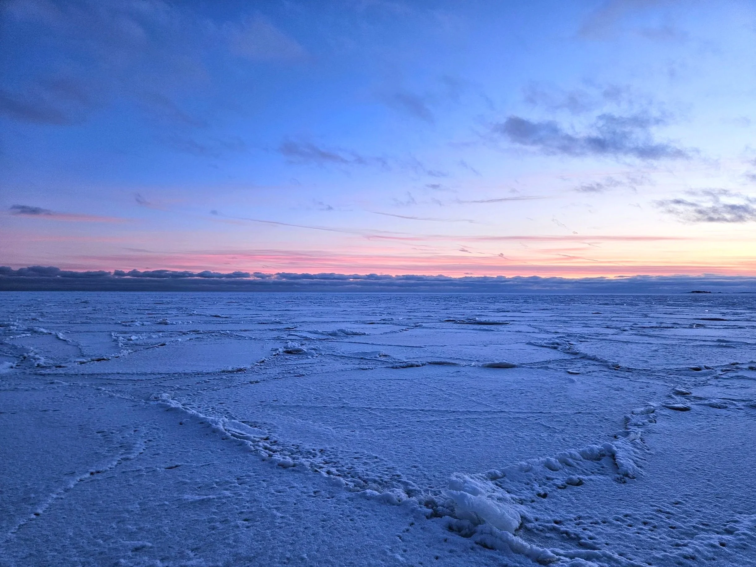
Sunset views on the way.
Conclusion
Satellite imagery brings extra context to ice conditions but obviously does not replace on-the-go judgment and safety precautions.
This was only 30m resolution, free imagery. Commercial-grade imagery would be another story. Notwithstanding, in early February conditions it already pointed out the dangerous Blominmäki wastewater outflow area and visualized boundaries such as shipping lanes and open water farther south. It showed the ice field I was about to go was largely uniform with no clear wet areas or structural changes in the past week.
The more unknown the area and the more dynamic the conditions, the more I suspect the analysis helps. After strong winds, heavy snowfall or in spring when weak and melting areas form, the ice field becomes much more diverse and dangerous.
We shall return to this analysis then.
See you,
Orbital Vantage