Measuring wildfire recovery from orbit: Thomas Fire and the return of green
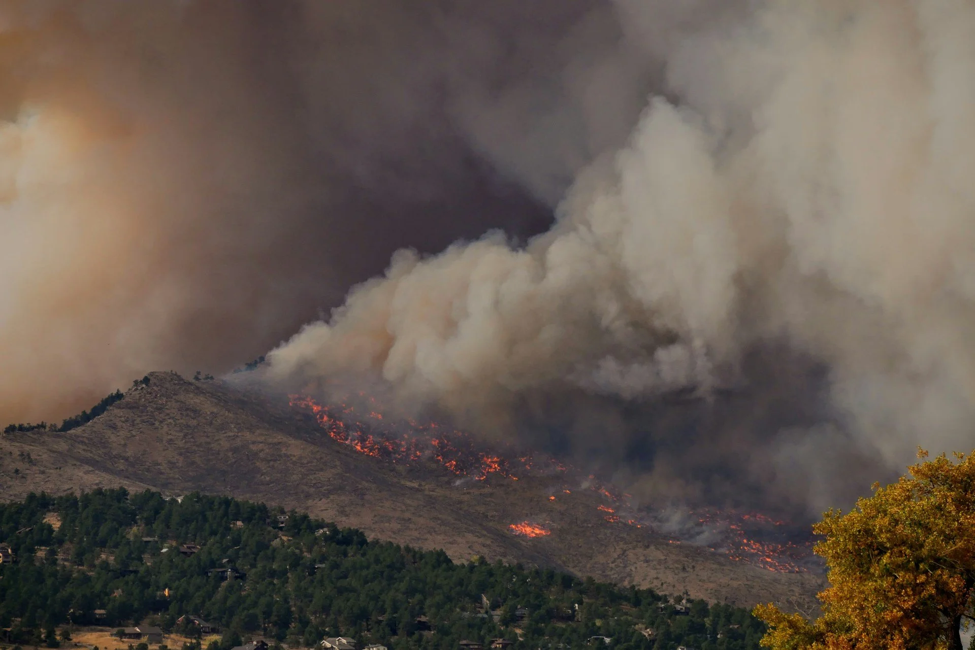
A wildfire in the US, but not the Thomas Fire. Photo by Malachi Brooks
As a kid, one morning I saw a large smoke column rise in the horizon. It was pretty clearly rising from a large forest fire.
I was staying at General Aviation airfield and had the chance to hitch a ride onboard a Cessna 172 Skyhawk venturing to the scene. From close-up, the smoke column was enormous and the massive flames went (reportedly) up to 60m, with heat radiation igniting fires 200m away from flames. Despite maintaining our distance, the smell of burnt wood made its way into the cockpit.
This fire is today know as “Tammela’s Great Fire”. At 250 hectares of thick forest burnt, it is small compared to large forest fires, such as the Thomas Fire in California in December 2017, which was 450x larger by area. It became one of the largest fires in California’s modern record at the time.
Today, we see if we can track the return of vegetation using NDVI index in the Thomas Fire Area in California using the published fire perimeter and Landsat satellite data.
Using NDVI as the indication
The measurement used today is NDVI: the Normalized Difference Vegetation Index.
NDVI is one of the simplest and most widely used satellite vegetation indicators. It compares how strongly the ground reflects red light and near-infrared light. Healthy green vegetation absorbs much of the visible red light for photosynthesis, while strongly reflecting near-infrared light. Bare soil, dead vegetation, rock, ash and built surfaces behave differently.
In simple terms:
High NDVI = greener, more photosynthetically active vegetation
Low NDVI = less green vegetation, bare ground, burn scars, dry vegetation or built surfaces
That makes NDVI useful after a wildfire, but NDVI does have an important limitation: it sees greenness, not ecological maturity. A slope covered in fresh grasses can produce a strong NDVI signal - similar to a thick forest that was burnt down.
Simple code to track monthly NDVI over last 10 years
When Orbital Vantage started these experiments, it took a lot of head-banging to get clean results. This time I was better armed with my structure and everything went smoothly.
First, the script starts by drawing the Thomas Fire perimeter from the MTBS burned area boundary dataset. This dataset is a rare find in my explorations, and gives the analysis a very exact geography focusing on the burnt area without need for manual drawing.
Thomas Fire perimeter displayed in Google Earth Engine as our study area. No need for manually drawn boxes this time.
Second, it pulls Landsat surface reflectance imagery over the fire perimeter between 2016 and 2026. The script masks clouds, cloud shadows and cirrus using the Landsat quality band. This matters because NDVI is very sensitive to bad pixels. A cloudy image can look like vegetation loss even when nothing has changed on the ground.
Third, it calculates NDVI for every usable Landsat image. High values indicate vegetation.
Fourth, it groups the imagery into monthly periods from 2016 to 2026. For each month, the script creates a median NDVI composite, then calculates the average NDVI inside the Thomas Fire perimeter. The result is a monthly greenness curve for the whole burned landscape.
Below are two quarterly composite images that were generated in the process. The first showing post-burn view with brown areas indicating low NDVI, and the second image showing situation in Q4/2025 when the ground is again green with high NDVI.
Post-fire quarterly baseline NDVI showing destroyed areas in brown, with some first signs of recovery or less affected areas in turquoise.
Q4/2025 composite NDVI showing strong returns indicating presence of vegetation.
The images are great eye-candy and puts us on the scene, but the actual target results is a monthly NDVI-curve that is not overly sensitive to short-term anomalies. Amazingly, all of this worked in three attempts, and I pivoted from a quarterly composite to monthly in the process.
The data shows recovery, but need some interpretation
Below is the monthly mean of NDVI between 2016 to 2026. There are three notable features to pay attention to:
The blooming winter peaks occurring in wetter March/April
The August-September troughs in the dry Californian summer
The Thomas fire effect that creates the lowest point in Q1/2018 with a brutal drop in December-February 2018 when it’s usually lushest
NDVI data generated by our script in Thomas fire area. IT shows typical seasonal variation, as well as the sudden drop in December 2018 created by the fire, followed by a slow recovery to pre-fire range.
This is the cleanest result I’ve gotten in these explorations. Either because I’ve gotten better or because NDVI and the Thomas fire is so well researched that AI had an easy time helping me with the script. I’ll take it either way.
While the fire’s effect is clear, interpreting the recovery is harder. Already in 2019 and 2020 the winter peaks reach typical heights. While nature does recover quickly, not this quickly. In practice, what we see is the grass, shrubs and “light” surface vegetation that springs back quickly.
But looking at the troughs, we see they remain significantly lower than before the fire. I believe the harsh dry summers kill off the light vegetation, leaving no robust shrubs and trees to keep up the NDVI index through the summer months. The same can be said about the winter peaks, whereby fewer areas with hard rock are yet covered by trees or shrubs.
As a sidenote, the seasonal variation also affects recovery and interpretation. Some years are drier and wetter, creating unique seasonal patterns. Such is the muted peak in 2021, which appears to be the second driest month in California’s history.
Overall, the recovery is best seen by the peaks and troughs slowly rising up toward pre-fire levels. The first time this happens is 2023, five years after the fire. Even still, this does not necessarily tell us the area has recovered, only that vegetation has indeed sprung back and beyond momentary grassy patches.
The recovery of the actual local ecosystem is probably best estimated based on how long the shrubs and trees take to grow to their full height and then die. A “forest lifecycle”, as I was thought in school, can take decades or longer.
This is exactly why satellite recovery analysis needs careful interpretation. If we only looked at January 2019, we might be tempted to say the Thomas Fire had recovered. If we look at the full monthly curve, it forces us to think what we’re actually seeing.
Conclusion: Why this matters
A wildfire is mostly seen as unwanted destruction, but wildfires are not automatically unnatural. In many dry landscapes, including parts of California, fire has long been part of the natural system. It becomes damaging when they are too frequent, too hot, too large, or followed by drought, erosion and invasive vegetation.
Satellite time series can help monitor wildfire prevalence, frequency and recovery, but do require on-site visits to evaluate the status and stage of recovery. For Orbital Vantage, this was another interesting application of satellite imagery.
See you,
Orbital Vantage
