Detecting Port of Singapore congestion with Sentinel-1 SAR
Singapore anchorage. Photo by Alexander K
This post is part of the Orbital Indicators series, where we turn satellite data into measurable signals of how the world is changing.
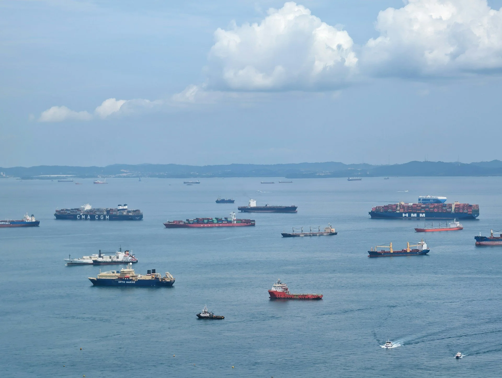
When I landed at Singapore the first time, the main thing I remember was seeing ships…so many ships both underway and anchored. I tried estimating how many there are but quickly gave up and concluded there’s over a hundred.
Port of Singapore is the second busiest port in the world after Shanghai, but the busiest global transshipment port. Economic and geopolitical events on the other side of the world can affect port operations weeks or months later. Conversely, what happens in Port of Singapore affects the rest of the world.
Today, I wanted to see whether Sentinel-1 SAR alone could detect congestion events in the Port of Singapore.
1. Building a counting engine
First, I needed a script that counts ships from a SAR image. Luckily, the ships in anchorage light up like a Christmas tree (see image below), which I took as an encouraging sign I don’t need sophisticated configuration or tuning to automatically count ships. Just press enter.
Sentinel-1 SAR Enhanced visual of Singapore anchorages.
Well, nothing is ever as advertised and three interconnected technical challenges emerged:
Under-counting ships massively, because our size-limit was too restrictive
Double-counting bright returns, as large ships created 2-3 distinct returns at bow, mid-ships and astern
Multiple small ships counted as one, as I tried to solve the second problem by smoothing
I replaced size-threshold with peak pixel identification to count the ships, then iterated the smoothing distance to connect multiple returns from one ship without merging adjacent ships.
As a result, the script gave me 200 ships. Some were still counted twice but there were around 200 in the image so 1-2% error margin was acceptable for this pass. See below how the script paints the ships in one of the iteration runs.
One iteration of the ship identification visualised still with many multi-return vessels present.
We could have also added a script that uses a terrain mask to easily focus only on water areas, but today it was easy to draw the anchorage area. To track ships in port, we would need to do that and build smarter crane vs. ship separation logics.
As sidenote, SAR doesn’t tell us what kind of ships they are, only a rough indication of size. A Maersk Triple E-Class container ship and VLCC tanker (Very Large Crude Oil Carrier) likely look very similar. But that is not necessary information for today.
2. Creating a system that counts over the last two years
One ship count is a cool trick. A more useful insight is how that count changes over time. Accordingly, I modified the counting script to look at past 12 months with 4 images evenly spaced out each month.
Disappointingly, my counting engine was too heavy to run with 50 images. I returned to the single-image script and started streamlining it. It had both heavy “raster” and “vector” computations that made it slow so those needed to be avoided with a new approach.
After a few trial-and-error rounds I had a script that was lightning-fast counting ships in the right ballpark, but not very accurate anymore. It almost always counted large ships as 2-3 dots because of bright returns per large ship.
To solve this, with the help of AI, I applied a geometric operation called morphological closing. It briefly expands the bright SAR returns (this distance needed some trial and error) so that in essence tiny gaps are patched, shrunk back, and then the connecting elements counted as one ship. Shrinking back was done to avoid secondary merges with nearby ships, though the chance here was small with spacious ship distances.
Most importantly, this approach had a more balanced raster & vector approach which was computationally light. The approach I used in my original single-image had worst of both world.
The script now worked both accurately and at volume. I adjusted it to analyse all available imagery. Below is an example where ships are reduced to points. See how both small ships clustered together and large ships are painted correctly just once.
Funnily enough, this scaled approach turned out to be much more accurate at counting ships than my original “robust” script.
3. Finding peak congestion events
Next, it was time to see how volume of ships in anchorage change over time. But Port of Singapore Anchorage is vast (see below) and time series over the whole area may not yield useful results: For port operation, changes in container ship numbers are not equal to change in small craft volume. Notice there are general anchorage areas, but also designated areas for tankers, explosives, small crafts, specific companies and more.
Port of Singapore anchorage map with target study areas circled. Image copyright Maritime & Port Authority of Singapore.
I sharpened the AOI to approximately focus on the Eastern Holding Anchorages A to C as well as the Western Anchorage (red circles in the map), which should better correlate with container traffic.
Target AOIs with ship points visualised in the latest available image.
The overall result below shows a median anchorage count of 53 vessels over the last 24 months with clear peaks. The peaks coincide with news of Port of Singapore congestion and are largely explained the Red Sea Crisis forcing ships to alternative routes and disrupting arrival schedules.
Final dataset illustration generated with GEE
As a validation step, I examined whether the dataset misses known congestion events. A brief study doesn’t reveal any missed severe congestion events, but the single low counts in May 2024 and June-July 2025 do warrant further thinking.
Debugging the image coverage tells me it’s not the result of SAR coverage or the counting, but likely real congestion dynamics. Reported congestion reflects waiting times, not simply vessel count. During peak congestion, ships may drift underway or anchor outside the defined AOI. Vessel count alone does not fully capture operational strain.
Also, port congestion happens in bursts rather than steadily escalating and declining situations. There are calmer days between the chaos and that is partly an indication for congestion likelihood: The ships are not arriving at optimal schedule in relation to port capacity.
Conclusion
Finding ships in SAR is not difficult but building a system that can efficiently and reliably count ships from a hundred images for congestion analysis took some trial and error.
SAR doesn’t tell us how long the ships must wait or what kind of ships are waiting, but importantly, this data is derived entirely from Sentinel 1 radar images without AIS or proprietary shipping databases. It demonstrates how open satellite data can independently detect macro-scale supply chain stress.
We shall revisit this capability in future.
See you,
Orbital Vantage